Reviewed and updated by the ToolBlur editorial team on July 30, 2026.
How to Compress Images to Speed Up Your Website
Large images are the top reason web pages load slowly. Learn how compressing them boosts speed, SEO and user experience — for free.
If your website feels slow, images are usually the culprit. A single uncompressed photo can be several megabytes — heavier than all your text, code and fonts combined. Compressing images is the fastest win for a faster site.
Why image size matters so much
Page speed affects everything: visitors leave slow pages, and Google uses speed (Core Web Vitals) as a ranking factor. Smaller images mean faster loads, better SEO, lower bandwidth costs and happier users — especially on mobile networks.
How compression works
Compression reduces file size in two ways: lowering quality slightly (which is often invisible to the eye) and resizing the image to the dimensions it is actually displayed at. A 4000-pixel-wide photo shown in a 800-pixel column is wasting 80% of its data.
Compress images in your browser
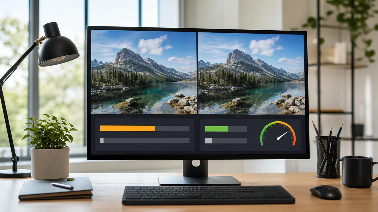
You do not need Photoshop. A free image compressor lets you upload a JPG or PNG, adjust the quality and maximum width, and download a much smaller file — all locally in your browser, so your images are never uploaded to a server.
Practical tips
- Aim for under 200 KB for most web images.
- Resize to the largest size the image is actually shown at.
- Start at 70–80% quality and lower it until you notice a difference.
- Keep an original copy in case you need to re-edit later.
Do this for every image on your site and you will often cut total page weight in half — a change your visitors and your search rankings will both appreciate.
Choose the right format before compressing
Compression cannot fix a poor format choice. JPEG is efficient for photographs, PNG is useful when you need lossless detail or transparency, and WebP often provides a smaller result for both photos and graphics. Keep SVG for simple logos and icons when you control the source. Always compare the output visually instead of choosing a format only from a file-size number.
Use dimensions that match the layout
First inspect the largest width at which the image appears. A card that never exceeds 600 pixels does not need a 4,000-pixel source on the page. Exporting at roughly twice the CSS width can keep high-density screens sharp without sending the full camera file. Responsive images can then let the browser choose a smaller resource for phones.
A repeatable quality test
- Keep the original file outside your website folder.
- Resize a copy to the maximum display dimensions.
- Export at 80% quality, then compare it at 100% zoom.
- Lower quality in small steps until artifacts become visible, then move one step back.
- Measure the page again rather than assuming the new file solved every speed issue.
Watch text, faces, gradients and sharp edges because damage appears there first. The best result is the smallest file that still looks correct in its real layout.
Performance beyond file size
Set width and height so the browser can reserve space and avoid layout shift. Load the main above-the-fold image promptly, but lazy-load images farther down the page. Google’s web.dev image guidance explains responsive sizing, formats and delivery in more depth. Compression is one part of the workflow; correct dimensions and loading behavior are equally important.
Measure before and after
Optimization should begin with evidence. Record the original dimensions and bytes, compress one copy, then compare the result in the page. Browser developer tools can show transferred size and loading time, while Lighthouse or PageSpeed Insights can flag oversized images and Largest Contentful Paint problems. Run more than one test because network and server conditions vary.
File size and transfer size are not always identical because browser caching and network compression affect delivery. For JPEG, PNG and WebP, the image file is already compressed, so HTTP compression normally provides little additional benefit. The biggest gains come from dimensions, format and encoding quality.
Responsive image example
A blog image may appear at 360 pixels on a phone, 700 pixels on a tablet and 1,000 pixels on a desktop. Sending one 2,400-pixel file to every device wastes data. Generate a few widths and describe them with srcset and sizes, or use an image component that does so reliably. The browser can then choose an appropriate candidate before downloading.
Protect the important image
The image that defines Largest Contentful Paint should not be hidden behind unnecessary JavaScript or lazy loading. Give it stable dimensions, an efficient source and appropriate priority. Images below the first screen can be lazy-loaded to avoid competing for bandwidth. Too many “priority” images cancel the benefit, so reserve it for the actual main visual.
Match compression to content
| Content | Starting choice | Inspect closely |
|---|---|---|
| Photograph | WebP or JPEG | Faces, hair, clouds and shadows |
| Screenshot | WebP or PNG | Small text and sharp UI edges |
| Logo or icon | SVG when appropriate | Correct view box and accessible label |
| Transparent graphic | WebP or PNG | Edges against light and dark backgrounds |
Avoid false savings
A tiny but visibly damaged image is not optimized. Neither is a large image hidden with CSS, because the browser still downloads it. Do not remove meaningful alt text to save bytes, and do not replace informative diagrams with decorative backgrounds that screen readers cannot discover. Performance and accessibility should improve together.
Keep the workflow maintainable
Document your maximum widths and target quality, automate routine resizing during the build, and review exceptions manually. Periodically sort the public image folder by size to catch new oversized assets. A one-time cleanup helps today; a consistent publishing rule prevents the same problem from returning next month.
Frequently asked questions
What quality setting should I use?
There is no universal number. Start around 75–85% for a photograph, inspect it at the size users will see, and adjust. Screenshots with small text may need a different format or higher quality.
Does WebP always beat JPEG?
Often, but not for every image and encoder setting. Compare actual outputs. A well-encoded JPEG can be smaller than a poorly configured WebP, and compatibility requirements may influence the choice.
Should every image be lazy-loaded?
No. Lazy-loading the main visible image can delay Largest Contentful Paint. Use it for images below the initial viewport and load the primary visual normally.
Does changing CSS width reduce download size?
No. CSS changes display dimensions, not the bytes transferred. Resize or generate a smaller source and use responsive image markup so the browser downloads the right candidate.
Can I compress an image repeatedly?
Repeated lossy saves can compound artifacts. Return to the original when creating a new version instead of recompressing an already compressed output.
Will compression alone give a perfect PageSpeed score?
No. Server response, JavaScript, fonts, caching, layout stability and third-party scripts also matter. Image work is valuable because images are often large, but it is one part of performance.